- Entry
- 016
- Source scale
- Block to tract
- Method
- Statistical geography, published units
- Section
- Boundaries
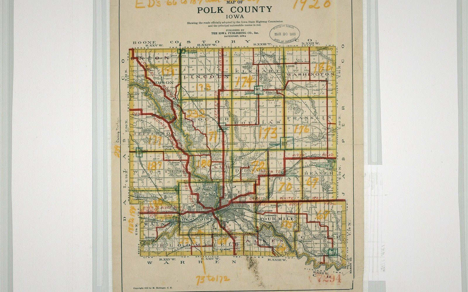
The lines on a statistical sheet look like the lines on a road map, and are arrived at by an entirely different procedure.
Photo: 1930 Enumeration District Map, Polk County, IA - NARA - 117090788 · Wikimedia CommonsThe Target Defines the Shape
A census tract does not begin with ground. It begins with a population band — in the United States, the Census Bureau's guidelines set a target of four thousand residents, acceptable anywhere between twelve hundred and eight thousand — and the boundary is then drawn to contain roughly that count. The line follows streets, waterways or administrative edges where it can, but its real job is numerical: include enough people, exclude enough others, and keep the unit compact enough to be useful for analysis. Geography is a constraint on the arithmetic, not the other way around.
This is worth pausing over, because a census tract reads on a sheet like any other polygon. It has a firm edge. It abuts its neighbours without overlap or gap. Printed at standard scale it looks as authoritative as a municipal boundary. Nothing in its appearance tells you that it was assembled around a demographic estimate, or that the estimate itself rested on the previous census, which was already a decade old when the lines were drawn for the next one.
The practical consequence is that tracts are periodically redrawn. When a fast-growing suburb pushes a tract's population above its ceiling, it is split; when a neighbourhood empties — through deindustrialisation, demolition, or outmigration — adjacent tracts may be merged. The result is that a tract boundary which seems stable can vanish between one decennial census and the next. Analysts wanting a time series across twenty or thirty years must either reaggregate to a higher geography that has stayed constant, or use a crosswalk — a proportional allocation table that redistributes one vintage's counts into another's polygons. Both methods introduce their own imprecision; the crosswalk compounds it by assuming population distributes evenly within each overlapping sliver, which is almost never true.
What the Line Commits To
Because the boundaries are drawn by local partnership — in the US, state and regional data users work with the Census Bureau through a programme called the Participant Statistical Areas Program — there is genuine local knowledge in the outcome. A tract might follow a freeway, a railway line, or a park edge that genuinely separates communities. But there is also negotiation, institutional inertia, and the occasional boundary that follows a historical artefact no longer visible on the ground. The line encodes not just demography but the preferences of whoever sat in the room when it was drawn.
This matters enormously when tract-level data is used for resource allocation, redlining analysis, or health mapping. The boundary is not a neutral container; it determines which addresses fall inside which aggregate, which rates get calculated at which denominators, and which neighbourhoods appear homogeneous or mixed depending purely on where the polygon was closed. Two addresses thirty metres apart may sit in tracts with median incomes differing by a third, not because the ground between them is economically discontinuous but because the tract edge happened to land there.

Compilation is desk work. What a field party recorded is turned into lines by someone who was not there.
Photo: Ron Lach / PexelsThe same logic applies to block level geographies below the tract, and to the higher-order groupings — block groups, tracts, counties — that statistical systems stack into hierarchies. Every tier was assembled around a target number of some kind. The hierarchy looks like a description of the world; it is actually a series of decisions about what size of container makes data manageable.
A Moving Target
There is a further wrinkle that map users rarely confront: the population figure around which a tract was drawn is an estimate, not a census. The American Community Survey, which runs continuously between decennial counts, itself uses a rolling five-year sample, and small tracts can carry margins of error that rival the estimates they attach to. A tract recorded as having thirty-two hundred residents may plausibly contain anywhere from twenty-six hundred to thirty-eight hundred. The boundary is precise; the number it was built around is not.

A surface has to be cut at some spacing before it can be drawn, and the spacing is chosen rather than measured.
Photo: kdadan97 / PexelsFor walkers and planners the lesson is familiar from contours and catchment lines: a drawn boundary is a committed position. It was produced by a method, at a date, for a purpose. Understanding the method does not dissolve the line, but it does tell you how seriously to take it when it contradicts something you can see on the ground — which, with statistical boundaries, it often will.
- US mechanismParticipant Statistical Areas Program; state and regional bodies negotiate boundaries with the Census Bureau
- Consequencelocal institutional preferences, not only demographic logic, are encoded in the final polygon